
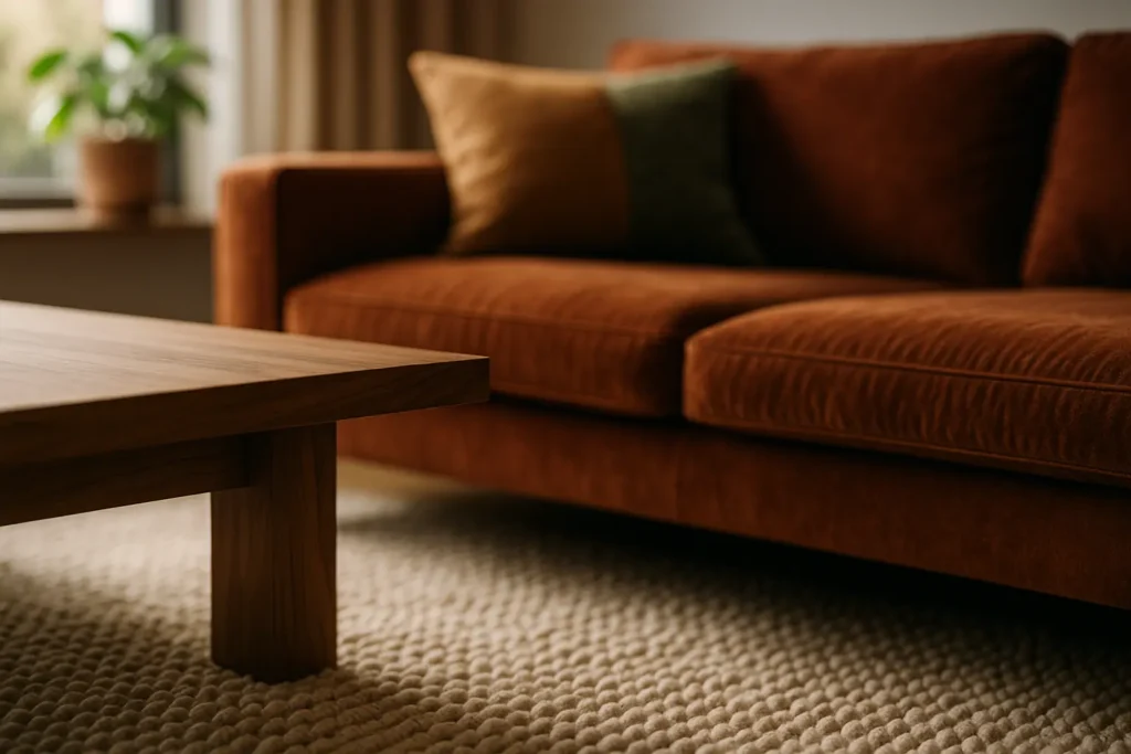
Texture is the part of decorating that gets written about in the vaguest possible language, which is a shame, because most of what it does can be measured. Reflectance, absorption and heat transfer are not poetic, but they explain why one room feels expensive and calm while an identically coloured room feels like a waiting area.
Key takeaways
- Sheen and colour depth together decide reflected light, and they are separate choices.
- Sound absorption is rated by NRC, averaged at 250, 500, 1000 and 2000 Hz.
- A carpet or rug is the single biggest acoustic lever in most rooms.
- Materials feel cold or warm because of heat conduction, not because of colour.
Texture is two different things, and mixing them up causes most of the trouble
Tactile texture is what your hand reads: the grain of oak, the nap of wool, the chalkiness of lime plaster. Visual texture is what the eye reads from across the room, which is mostly a pattern of tiny highlights and shadows created by that surface relief. A photograph of a bouclé sofa carries visual texture and none of the tactile kind, which is exactly why so many rooms assembled from images feel flat once they exist.
The practical consequence is that you cannot specify texture by looking at swatches on a screen. Anything you will sit on, walk on or lean against has to be judged in the hand, and anything that lives above eye level can be judged on relief and shadow alone.
Job one: how much light the surface gives back
Every surface has a light reflectance value, or LRV, on a scale from 0 for a perfect black to 100 for a perfect white. It states the share of the light falling on a surface that gets thrown back into the room. A wall at LRV 80 keeps a small lamp working across the whole space; a wall at LRV 15 turns the same lamp into a pool of light and everything else goes quiet.
Sheen is the second, independent dial. Paint finishes are graded by gloss units, and the industry bands run roughly from matte below 10, through eggshell at 10 to 15 and satin at about 26 to 40, up to semi-gloss at 41 to 69 and full gloss at 70 to 90. The underlying LRV of the colour does not change between finishes. What changes is how the light comes back: a matte surface scatters it evenly and reads as deeper, while a glossy one returns a sharp specular highlight and reads as brighter and harder.
This is the mechanism behind the oldest texture trick there is. Put a rough matte surface next to a smooth reflective one in the same colour family and the contrast is legible even in a room with no colour contrast at all. Lime-washed walls against a polished stone top, or a heavy linen curtain against a lacquered cabinet, do the whole job. How you light those surfaces decides whether the effect appears at all, which our guide to building lighting in layers covers in detail.
Job two: how long the room holds on to sound
Hard surfaces reflect sound almost perfectly. Glass, plaster, concrete and a bare timber floor return nearly everything that hits them, and the result is the ringing, slightly exhausting quality that people usually blame on a room being “empty”. Soft, deep, fibrous surfaces convert some of that energy into heat instead, which is what absorption means in practice.
The rating to know is the noise reduction coefficient, or NRC. It averages a material’s absorption at 250, 500, 1000 and 2000 Hz, on a scale where 0 is a perfect reflector and 1.0 a perfect absorber. Carpet industry acoustic bulletins put a standard commercial cut pile at around 0.25, meaning roughly a quarter of the sound energy hitting it is absorbed. Raise the pile and add a proper underlay and published figures move into the 0.35 to 0.55 band. Given that a rug can cover most of a floor, no single decorating decision moves a room’s acoustics further.
Curtains behave differently from what people expect. A flat panel of fabric stretched across a window absorbs barely more than the wall behind it. The same fabric gathered to real fullness, with an air gap between it and the glass, performs dramatically better, because the folds add depth and surface area. If you are hanging curtains partly for quiet, the fullness ratio and the depth of the track matter more than the cloth you choose.
Job three: how warm the surface feels to touch
A marble sill and a wool throw in the same room are at the same temperature. The marble feels cold because stone and metal conduct heat away from your skin quickly, while wool, wood and cork conduct it slowly and so feel neutral or warm. Nothing about the colour is involved, which is why a warm-toned steel handle still feels cold at seven in the morning.
Design that ignores this produces rooms that photograph well and are unpleasant to use. The rule we apply is simple: anything the body meets directly, seat, armrest, floor beside a bed, handle, tap, door pull, gets a slow-conducting material or at least a covering. Fast-conducting materials belong where they are seen and not touched, or where their coolness is the point, as with a stone worktop for pastry.
A method that keeps layering under control
Adding texture without a plan is how rooms end up busy. The sequence below allocates each job to a different layer, which keeps the count down.
- Fix the acoustic layer first. Rug, curtains, upholstery. These are the big surfaces and they are expensive to change later.
- Set one dominant texture. Choose the material that will occupy the most square metres and let it lead, whether that is oak, lime plaster or wool.
- Add one true contrast. The dominant texture needs an opposite, not five relatives. A single reflective or hard surface against a matte room is enough.
- Keep small textures to a supporting role. Baskets, ceramics and throws are punctuation. When they carry the whole scheme, the room reads as cluttered rather than layered.
- Check it under evening light. Texture is a shadow effect, so it appears and disappears with the angle of the light. A scheme judged only at midday will look different every night.
| Surface | Main job it does | Where it earns its place |
|---|---|---|
| Deep-pile rug with underlay | Sound absorption, warm underfoot | Any hard-floored room that echoes |
| Gathered lined curtain | Absorption plus light control | Rooms with large glazing |
| Matte lime or clay plaster | Diffuse reflection, visible relief | Walls that catch raking daylight |
| Polished stone or lacquer | Specular highlight, contrast | One surface per room, no more |
| Wool, bouclé, sheepskin | Slow heat conduction, touch | Seating and anything skin meets |
The three mistakes we see most often
Too many mid-textures. Five surfaces that are all vaguely rough cancel each other out. Contrast needs a genuine extreme at each end.
Texture used to fix a lighting problem. Piling on throws and baskets will not warm up a room lit by a single cool overhead fitting. Fix the light first, then judge whether the room still needs anything.
Ignoring maintenance. Open-pore timber, unsealed plaster and pale bouclé all record daily life quickly. That is fine if you want patina and a problem if you do not, and it is worth deciding which before ordering.
What readers ask us about texture
Can a small room take a lot of texture?
Yes, but the contrast has to come from fewer materials. In a small room the same five textures sit closer together in the field of view, so they read as noise rather than depth. Two strong ones usually beat five mild ones.
Does a textured wall make a room look smaller?
A deep matte finish reduces reflected light, which makes boundaries harder to read and can make a room feel more enclosed. Whether that reads as smaller or as cosier depends entirely on how the room is lit after dark.
Is there a rule for how many textures to use?
We do not think a fixed number holds up. What holds up is a hierarchy: one dominant material, one true opposite, and everything else in a supporting role.
Do plants count as texture?
Visually, very much so, since foliage produces fine shadow relief that no fabric matches. Acoustically they do almost nothing at domestic quantities, so do not buy them expecting a quieter room.
The useful shift, once you start thinking this way, is that texture stops being the last thing added to a finished room. It becomes the layer that decides how the room sounds when someone talks in it, how it reads at eight in the evening, and whether sitting down in it is pleasant. Colour can wait.
Want the material story behind these surfaces?
From hand-formed clay walls to switchable glass, the substances themselves carry a fair amount of narrative.
Sources: light reflectance value and paint gloss unit bands, industry paint specification guidance; noise reduction coefficient definition and test frequencies, standard acoustic references; carpet absorption figures, Carpet and Rug Institute technical bulletin on the acoustical characteristics of carpet, and published rug absorption tables. Figures for curtains vary widely with fullness and are given as orders of magnitude rather than fixed values. Updated August 2026.