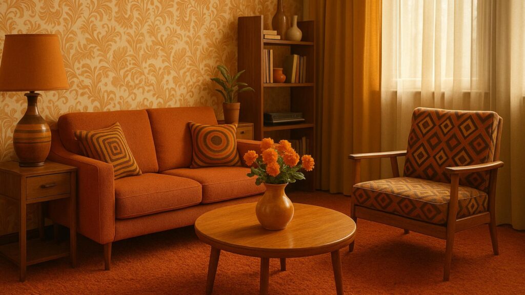
Every seventies revival we have watched sells the same three things: burnt orange, a shag rug, and a cane sideboard. All surface, none of it wrong, and none of it the reason the decade is worth revisiting. The genuinely durable ideas from the 1970s were structural, and the one thing nobody puts in a mood board is what you are legally obliged to check before stripping a ceiling in a house from that era.
Key takeaways
- Modular seating from 1971, such as Roche Bobois’ Mah Jong, is still in production for a reason.
- Period colour works best as a small share of the room, or as the whole envelope, rarely in between.
- US textured paint lost asbestos in 1977; UK Artex kept it until 1984.
- Residential lead paint was banned in the US in 1978, which sets the renovation threshold.
What actually survived the decade
The 1970s solved a problem that has come back: how to make one room do several jobs without rebuilding it. The answer was modularity, and the clearest surviving example is the Mah Jong seating system Hans Hopfer designed for Roche Bobois in 1971. It is three components, a flat square, a back and a corner, and nothing else. It has stayed in production for more than five decades and became the manufacturer’s best seller from 1990 onward, which is an unusually hard piece of evidence in a field that mostly trades in taste.
Two more things held up. Solid timber carcasses in teak, walnut or oiled beech can be sanded and re-oiled indefinitely, which is why period sideboards still circulate on the secondhand market while their 2010s veneered equivalents do not. And rattan, cane and jute get better with wear rather than worse, provided they stay out of a damp room and away from a radiator that dries them to brittleness.
The palette, read as pigment rather than nostalgia
Avocado, mustard and burnt orange are muted, warm and low in chroma, which is precisely why they read as dated when used at 40% of a room and as sophisticated at either 10% or 100%. In between is where seventies schemes go wrong.
The low-commitment version is textile-led: two cushions, a throw and a rug carrying the colour, on otherwise neutral walls. The high-commitment version is the whole envelope, walls and ceiling in the same deep tone in a matt finish, which suits a small north-facing room far better than the white everyone defaults to. Matt matters here, because these pigments look muddy under a sheen. If you want to push further into pattern and layering, our take on whether maximalism is the new minimalism covers where the ceiling on that is.
The parts that deserve to stay forgotten
Deep shag pile is a maintenance contract, not a floor covering. It needs a vacuum with the beater bar off, it flattens under any furniture leg, and in a household with a pet it is effectively unmaintainable. A short-pile wool rug with a chunky loop delivers most of the visual texture at a fraction of the upkeep.
Vinyl wallcovering is the other one to skip. It seals the wall, which in an older, solid-walled house traps moisture behind it and produces the exact damp problem people then blame on the building. Paper or a mineral paint lets the wall breathe. Timber cladding is worth keeping only where the boards are solid and can be stripped and oiled; thin printed panelling has no second life.
Before stripping anything in a genuinely period house
This is the section the revival articles skip, and it is the one that matters. Textured decorative coatings and paint layers from this era can contain hazardous materials, and the safe assumption is always that they do until a test says otherwise.
| What you are disturbing | Date threshold | What to do first |
|---|---|---|
| Textured or sprayed ceiling coating, US | Asbestos banned from textured paint and patching compounds in 1977 | Sample and test before any sanding or scraping |
| Artex or textured coating, UK | Asbestos-containing product made until 1984 | Survey by a competent asbestos professional |
| Old paint layers, US housing | Residential lead paint banned in 1978 | Use a contractor working to the EPA Renovation, Repair and Painting rule |
The practical rule is simple: never dry-sand, never dry-scrape, and never power-sand an original ceiling texture or paint layer in a house of this age before it has been tested. Overboarding a textured ceiling with plasterboard rather than removing it is frequently the cheaper and safer route, and it is the one a competent contractor will suggest first. Rules and thresholds vary by country and by state, so confirm the current local requirement rather than relying on a general summary, including this one.
Sequencing a seventies scheme without overspending
- Buy the seating secondhand, not the accessories. Period modular seating and solid-wood storage hold value and can be reupholstered. Cushions and rugs are where the reproduction market is honest and cheap.
- Fix the lighting before the colour. These palettes need warm, low, multiple sources. A single ceiling fitting will make any of them look grim regardless of the paint.
- Test the paint on the actual wall, in the actual room. Two coats on a large offcut of lining paper, moved around the room across a full day. Sample pots cost less than a repaint.
- Add pattern last and in one place. One wall, one curtain or one rug. Three pattern sources in a single room is the seventies cliché people are actually reacting against.
- Reserve budget for the boring layer. If the house is genuinely of the period, testing and safe removal has to be funded before the decorative work, not after it.
Questions we get about the era
What defined 1970s interiors? Muted earth tones, geometric and floral pattern used at scale, natural fibres such as rattan and jute, timber panelling, shag textiles and modular low-profile seating built for informal living.
How did technology shape the look? Cheap synthetics arrived at volume, which is why vinyl, moulded plastic and man-made pile are so characteristic of the decade. Open plan spread over the same period, driven by a preference for shared, flexible rooms.
Why so many earth tones? They tracked a broader environmental turn in the culture. Colours and materials that referenced the natural world read as current at the time, in the same way that muted greens do again now.
What furniture styles dominated? Low, modular and comfort-led. Sectional seating, bean bags, wicker and rattan, and storage systems designed to be reconfigured rather than fixed in place.
Strip away the nostalgia and the decade leaves a workable brief: build in components, choose materials that can be repaired, commit properly to a colour or leave it at accent scale, and check what is on the ceiling before you touch it. That is a more useful inheritance than a shag rug.
Working on the tactile side of a scheme?
Period materials rely on texture far more than on colour to carry a room.
General guidance only, not a substitute for a site-specific survey by a qualified professional. Sources: Roche Bobois on the Mah Jong collection designed by Hans Hopfer, 1971; US Consumer Product Safety Commission ban on asbestos in textured paint and patching compounds, 1977; US residential lead paint ban, 1978, and the EPA Renovation, Repair and Painting rule for pre-1978 housing; UK guidance on asbestos-containing textured coatings produced until 1984. Updated August 2026.