
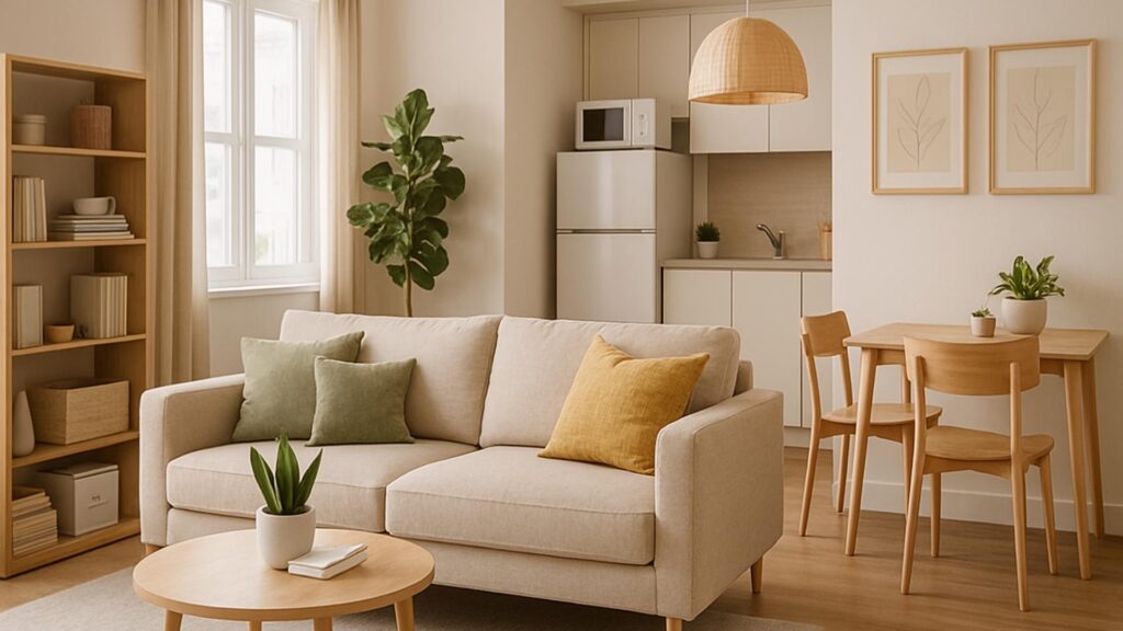
Cramped is not the same thing as small. Plenty of 40 square metre flats read as calm and generous, and plenty of larger ones feel like a corridor with furniture in it. The difference almost always comes down to a short list of measurements that were either respected or quietly ignored at the layout stage.
Key takeaways
- The NKBA Kitchen Planning Guidelines set a minimum walkway of 36 inches and a work aisle of 42 inches for one cook.
- Standard living room practice: 14 to 18 inches between sofa and coffee table, 30 inches minimum for secondary routes.
- RentCafe put the average US apartment at 908 sq ft in 2024, with studios averaging 457 sq ft.
- Studios and one-bedrooms made up 52.7% of newly built rental units that year.
Protect the circulation before you choose anything
The single most reliable way to make a room feel bigger costs nothing: decide where people walk, and refuse to negotiate on that path. Rooms feel tight when the body has to break stride, turn sideways or shuffle past a corner. That sensation registers long before anyone consciously notices the square footage.
A handful of dimensions carry most of the weight. They come from kitchen and bath standards on one side and long-standing furnishing practice on the other, and they are worth writing on the plan before the first purchase.
| Where | Minimum | Comfortable |
|---|---|---|
| Main walkway through a room | 36 in / 91 cm | 42 in / 107 cm |
| Secondary route between pieces | 30 in / 76 cm | 36 in / 91 cm |
| Kitchen work aisle, one cook | 42 in / 107 cm | 48 in / 122 cm |
| Sofa to coffee table | 14 in / 36 cm | 18 in / 46 cm |
| Dining table edge to wall | 36 in / 91 cm | 44 in / 112 cm |
The NKBA figures are published guidelines for kitchens; the living and dining numbers are conventional furnishing practice rather than a code. Both are worth treating as fixed, because they are the ones a body notices every single day.
Three moves that buy the most apparent space
Show the floor
Visible floor reads as available floor. Furniture on legs, a sofa that does not skirt to the ground, a console rather than a solid sideboard: each one lets the eye run under the piece and continue to the wall. It is the cheapest illusion in the trade because it costs nothing in actual square metres. Wall-hung vanities and floating bedside tables work on exactly the same principle.
Take one wall to the ceiling
Storage sprawls horizontally when it is not allowed to go up. A single wall of full-height joinery, ideally painted the same colour as the wall it sits on, will absorb more than three low units scattered around the perimeter, and it leaves the other three walls quiet. The visual cost of storage is not its volume, it is how many separate objects the eye has to count.
Buy the long sightline
Stand in the doorway. Whatever your eye lands on first sets the perceived depth of the room. If it lands on the back of a chair two metres away, the room is two metres deep. Keeping the tallest pieces out of that line, and putting a mirror or a window at the end of it, extends the read without moving a single wall. This is also why the door swing matters more in a small flat than in a large one.
Light does the work colour gets credited for
Pale walls are the standard advice and they are only half the story. A white room with one ceiling fitting still feels flat and boxy, because a single overhead source throws everything into the same shadowless plane and pushes the corners into gloom. What opens a room up is having three or four separate sources at different heights, so the eye reads depth rather than a lit box.
The practical version: one ambient source, one or two at table or floor height, and something washing a vertical surface. A wall-washer or a picture light on the far wall does more for apparent depth than any amount of white paint, because it tells the eye there is something back there. We went into the full method in our piece on layered lighting and why it matters, and it applies with more force in small rooms, not less.
As for colour itself: light shades do expand a room modestly, but a saturated colour taken across walls, trim and ceiling together often works better than a pale wall with white woodwork. Contrast is what draws the boundary. Remove the contrast and the boundary softens, whatever the shade.
What the market is actually building
This is not a niche problem. RentCafe’s analysis of 2024 completions put the average US apartment at 908 square feet, with studios averaging 457 square feet and one-bedrooms 735. One-bedrooms alone accounted for 48% of everything built that year, and studios plus one-bedrooms together made up 52.7% of new rental units.
Worth noting for accuracy: sizes ticked up slightly in 2024 rather than down, reversing a decade-long contraction. Studios gained 13 square feet on the previous year. The trend is not that homes are collapsing in size, it is that the small unit has become the default product, which makes the layout question a mainstream one rather than an urban curiosity.
Mistakes we see repeatedly
Furniture scaled down instead of scaled right. Six small pieces read as clutter; two properly sized ones read as calm. A generous sofa against the long wall usually beats a compact one plus two armchairs.
The rug that stops short. A rug too small for the seating group visually shrinks the whole zone. Under a dining table it needs to extend roughly 24 inches past the edge so chairs stay on it when pulled back.
Curtains hung at the window. Fixing the track at the top of the frame draws a line where the wall stops. Mounting close to the ceiling and letting the fabric run past the frame on both sides borrows height and lets in more light.
Everything pushed to the walls. Perimeter seating creates a void in the middle that reads as a corridor. Pulling a sofa a few centimetres forward and letting a rug define the group nearly always reads better.
Quick answers
Do mirrors really make a room look bigger?
They extend a sightline, which is not the same as adding space. A mirror facing a window or closing a long view works. A mirror reflecting a blank wall simply adds a large object.
Is an open-plan layout always better in a small flat?
No. Removing partitions buys sightlines and costs acoustic and visual separation. In a studio, a half-height unit or a curtain track that defines a sleeping zone often improves daily life more than total openness.
Can dark colours work in a small room?
Yes, provided they are carried onto the trim and ceiling and the lighting is layered. The failure mode is a dark wall next to bright white woodwork, which draws the boundary sharply.
What single change gives the fastest result?
Clearing the main walkway and moving anything that forces you to turn sideways. It takes an afternoon, costs nothing, and changes how the space feels immediately.
None of this requires knocking anything down. Small rooms punish imprecision more than large ones, which cuts both ways: the same tolerance that makes a bad layout obvious makes a considered one feel deliberately, quietly generous.
Working with a tight budget as well as a tight floor plan?
The low-cost interventions that change a compact flat the fastest.
Sources: National Kitchen & Bath Association, Kitchen Planning Guidelines with Access Standards (walkway and work aisle minimums); RentCafe, national apartment size analysis of 2024 completions, published April 2025. Living and dining clearances reflect conventional furnishing practice rather than a regulatory standard. Updated August 2026.