Zillow’s 2026 home trends report contains a number that quietly settles this argument. Mentions of colour drenching in listing descriptions were up 149% year on year, and colour drenching means painting the walls, ceiling, trim and doors of a room the same shade. In other words, the market has not gone back to white boxes. It has gone past the single feature wall, in the direction of more colour rather than less.
Key takeaways
- Colour drenching mentions in Zillow listings rose 149% year on year for 2026.
- 1stDibs found 39% of designers reporting maximalism, up from 34% in 2023.
- Light reflectance value runs 0 to 100 and predicts how dark a wall will actually feel.
- EU interior matt wall paints are capped at 30 g/l of VOC under the Decopaint Directive.
The technique survived, the reflex did not
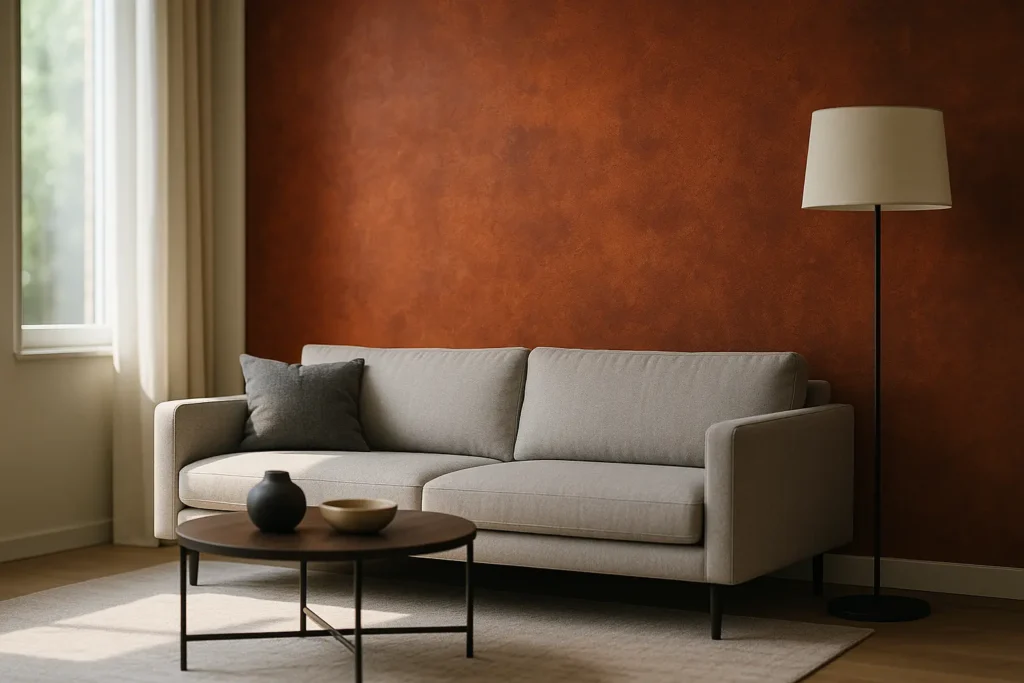
The accent wall earned its bad reputation honestly. Between roughly 2010 and 2020 it became the answer to every question: one wall in a stronger colour, usually the one behind the largest piece of furniture, chosen without reference to the shape of the room or where the light came from. Repeat that in enough rooms and it stops reading as a decision and starts reading as a habit.
What replaced it is not restraint. Colour drenching pushes a single shade across every surface, which removes the contrast lines that made a feature wall look bolted on. Its gentler cousin, sometimes called colour capping, carries the wall colour up onto the ceiling and stops there. Both are more committed than an accent wall, not less, and both are easier to live with because there is no arbitrary edge where one decision stops and another begins.
When one wall is still the right call
There are three situations where treating a single plane differently remains defensible, and they have nothing to do with breaking up beige.
The wall already exists as an object
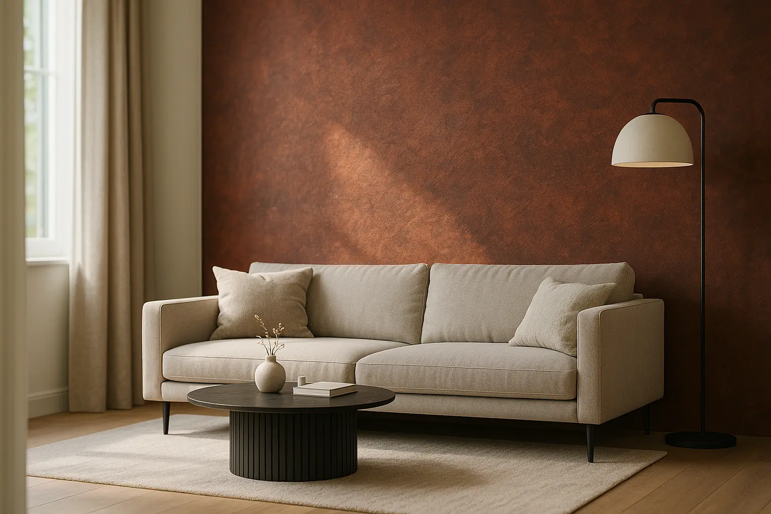
A chimney breast, a run of built-in shelving, a recessed alcove or the wall a staircase runs against is already a separate element architecturally. Painting it differently describes something the room is doing anyway. Painting the flat wall next to it differently invents a division that is not there.
You are renting
One wall is a smaller favour to ask and a smaller job to reverse. Worth saying plainly: repainting a rented property normally needs the landlord’s written agreement, and a tenancy that requires the walls returned to their original colour makes a dark shade an expensive gesture. Two coats of a strong pigment take three or four coats to cover on the way out.
The room has one wall that never gets light
In a long room lit from one end, the far wall sits in permanent shade. A deeper colour there absorbs less light than people fear and stops the wall reading as grey mush, which is what a mid-tone does in low light. This is the one case where a single darker plane genuinely outperforms drenching.
The number that decides whether it works
Most accent walls fail for a measurable reason rather than a stylistic one. Light reflectance value, printed on most fan decks, runs from 0 for absolute black to 100 for pure white and describes how much visible light a colour returns into the room. A shade at LRV 8 in a north-facing room with one small window will not read as moody, it will read as a hole. The same colour on a wall that gets afternoon sun will look like the swatch.
Sheen matters almost as much, because it decides how much of that light comes back as glare rather than colour. Paint gloss is measured in gloss units, and the usual bands run from matt below 10, through eggshell at roughly 10 to 15 and satin at 26 to 40, up to semi-gloss between 41 and 69 and full gloss from 70 to 90. On a large uninterrupted wall, anything above satin will show every imperfection in the plaster, and a strong colour magnifies the effect.
The practical test is unglamorous: paint an A2 sheet of lining paper with two coats, tape it to the wall, and look at it at three points in the day before committing. Colour on a screen or in a 5 cm swatch tells you almost nothing about a whole plane.
What the 2026 colour lists are actually signalling
The colour of the year announcements made between October and December 2025 are unusually consistent, and worth reading as a group rather than individually. Pantone chose Cloud Dancer 11-4201, the first white since the programme began in 1999. Benjamin Moore announced Silhouette AF-655, a deep espresso, on 16 October 2025. Sherwin-Williams went to Universal Khaki SW 6150. Dulux and AkzoNobel published a trio under the name Rhythm of Blues, Behr chose Hidden Gem, Graham & Brown Divine Damson, Valspar Warm Eucalyptus.
Not one major brand picked a cool grey. That is the story: warm neutrals and deep browns on one side, saturated jewel tones on the other, with the grey-beige middle ground of the last decade abandoned by everyone at once. The designer data points the same way. 1stDibs, surveying 468 interior design professionals for its ninth trends report published on 17 November 2025, found 39% reporting maximalism as a client request, up from 34% in 2023, with eclecticism at 38% and chocolate brown at 33%.
A palette moving in that direction rewards commitment and punishes hedging, which is exactly why the half-measure of one bolder wall feels dated right now. If you want the longer version of how palette choices read to other people, our piece on what a home colour palette says about you takes that angle.
Practicalities people discover afterwards
Two things are worth knowing before the tin is open. In the European Union, the Decopaint Directive 2004/42/EC has capped volatile organic compound content in interior matt wall and ceiling paints at 30 g/l since 2010, for both water-based and solvent-based products, and the figure has to be printed on the tin. Low VOC is now the legal floor rather than a premium feature, so a product marketing itself on that alone is telling you very little.
The second is edges. A drenched room needs no cutting-in against a contrasting colour, which is why amateur results often look better than a two-colour scheme. If you do stop at one wall, the corner where the colours meet is the only thing anyone will look at, and it is worth the extra hour and a decent low-tack tape.
Straight answers
Does an accent wall make a small room look bigger?
No. That belief comes from a misreading of perspective. A darker end wall can make a narrow room feel shorter and wider, which is sometimes an improvement, but nothing painted on one plane adds perceived volume. Carrying one colour across everything does more, because it removes the edges the eye uses to measure the box.
Will a dark wall hurt resale value?
Paint is the cheapest thing in a house to change, and the Zillow data suggests buyers are currently drawn to bolder interiors rather than repelled by them. If a sale is imminent, the question is condition rather than colour: a patchy dark wall reads worse than any shade applied properly.
Is wallpaper a better option than paint for one wall?
Often yes, and for a reason that has nothing to do with taste. Pattern and texture give the eye a reason for the wall to be different, which is the justification a flat block of colour lacks. It is also the version that survived the trend cycle most intact.
So the answer to the title is not the one the question expects. Accent walls are not outdated, they are demoted: from default move to specific tool, used when the architecture already asked for it. Everything else that used to be solved with one bolder wall is now being solved by painting the whole room and meaning it.
Wondering what else is on the way out?
Some of this year’s most repeated ideas are worth adopting and three of them are worth skipping entirely.
Sources: Zillow 2026 home trends report for a 149% year-on-year rise in mentions of colour drenching in listing descriptions. 1stDibs ninth annual Interior Designer Trends Survey, 468 professionals, published 17 November 2025, for maximalism at 39% against 34% in 2023, eclecticism 38% and chocolate brown 33%. Colour of the year announcements made between October and December 2025 by Pantone (Cloud Dancer 11-4201, the first white since the programme launched in 1999), Benjamin Moore (Silhouette AF-655, announced 16 October 2025), Sherwin-Williams (Universal Khaki SW 6150), Dulux and AkzoNobel (Rhythm of Blues), Behr (Hidden Gem), Graham & Brown (Divine Damson) and Valspar (Warm Eucalyptus). Directive 2004/42/EC, the Decopaint Directive, for the 30 g/l VOC limit applying to interior matt wall and ceiling coatings since 2010. Light reflectance value and gloss unit bands are standard industry measures. Tenancy conditions on redecoration vary by country and by contract; check the agreement before painting a rented property. Updated August 2026.