
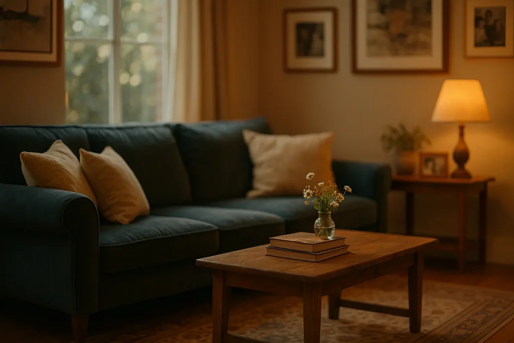
Advice about decorating for feeling almost always arrives in the same form: a colour wheel with moods attached. Blue for calm, yellow for optimism, green for balance. It is the most repeated guidance in the category and, judged against the research, one of the weakest. The levers that reliably change how a room feels sit somewhere else entirely.
Key takeaways
- Ulrich’s 1984 study in Science found surgical patients with a view of trees left hospital sooner and took fewer strong painkillers than matched patients facing a brick wall.
- Brown and colleagues, writing in PLOS Biology in March 2022, put the daytime target at 250 lux melanopic EDI at eye level and the evening ceiling at 10 lux.
- Elliot and Maier’s 2014 review concluded that colour effects are context-dependent, and that much earlier research was methodologically weak.
- The practical order is view, light, texture, control, then colour. Most decorating advice runs it backwards.
The finding that started evidence-based design
The single most-cited result in this field is nearly forty years old and involves no decorating at all. Roger Ulrich examined the recovery records of gallbladder surgery patients at a suburban Pennsylvania hospital between 1972 and 1981, comparing 23 patients whose rooms looked out on a stand of trees with 23 matched patients whose windows faced a brick wall. Patients were paired on sex, age, smoking status, weight, year of surgery and floor.
Those with the natural view had shorter postoperative stays, needed fewer potent analgesics, and drew fewer negative comments in nursing notes. It was published in Science in 1984 and became the foundation of what is now called evidence-based design.
Two honest caveats. Forty-six patients in one hospital is a small sample, and a surgical ward is not a living room. What the study supports is a direction, not a dosage. But the direction is worth taking seriously, because it says the emotional payload of a room is partly outside the room.
If your window faces a wall, the practical moves are the boring ones. Put the chair you actually sit in next to the window rather than opposite the television. Keep the sill clear so the glass reads as an opening rather than a shelf. Plants on the sill do some of the work when the outlook does none, and a mirror set perpendicular to the window borrows the brighter part of the view rather than reflecting the wall back at you.
Light does more emotional work across a day than paint does
Lighting is where the evidence has firmed up most in the last five years, and it is almost entirely about timing rather than fittings. Brown and colleagues, in PLOS Biology in March 2022, set out daily targets for healthy adults: a minimum of 250 lux melanopic EDI measured vertically at eye level during the day, a maximum of 10 lux in the three hours before bed, and near-darkness during sleep.
Read that as a decorating brief and it reorganises a room. Daytime wants brightness at eye height where you sit, which usually means moving furniture towards the daylight rather than adding lamps. Evening wants the opposite: low, warm, sideways light from several small sources, not one ceiling fitting doing everything. A single overhead pendant on a dimmer still puts light where it does the most circadian damage, straight into the eye from above.
The cheapest version of this we would recommend is three light sources per living space at different heights, all warm, all on separate switches. Whether a room feels like an office or a refuge at nine in the evening is decided by that arrangement far more than by the colour of the walls. We went further into the bedroom side of this in our piece on how interior design influences your sleep.
Colour is real, and it is smaller than the chart claims
None of this means colour does nothing. It means the popular version of colour psychology outran its evidence. Elliot and Maier’s review in the Annual Review of Psychology in 2014 was explicit that early research in the area was hampered by methodological problems, and that the effects that do hold up are best understood as colour-in-context: the same hue carries different meaning depending on where it appears and what the person is doing.
Red on an exam paper and red on a front door are not the same stimulus. A blanket claim that a colour produces a mood, detached from context, is not what the literature supports.
What survives is more modest and more useful. Colour changes perceived brightness and perceived size, both of which affect comfort. And personal association is powerful even where population-level effects are weak. So the practical method is empirical rather than theoretical: paint A2 sheets, not patches on the wall, prop them against each wall in turn, and look at them at eight in the morning and again at eight at night under the lamps you will actually use. Half the shortlist dies at that second viewing.
Writing an emotional brief, room by room
The useful discipline is to name the moment a room exists for, then ask what would change that specific moment. Most rooms are decorated for how they look empty, which is the one state nobody experiences them in.
| Room | The moment that actually matters | Where the leverage is |
|---|---|---|
| Entrance | The ninety seconds after you walk in | Somewhere to put everything down, and light on a timer so you never enter a dark space |
| Living room | Evening, seated, two or more people | Seating angled towards each other, and low warm light at 2700K or below |
| Kitchen | Cooking while someone talks to you | A surface for the person not cooking, and task light that does not throw your own shadow |
| Bedroom | The last hour before sleep | Bedside light you can reach lying down, blackout at the window, no overhead fitting in use |
| Workspace | Hour three, not hour one | Daylight at eye level, a chair that survives three hours, and a wall you can look away at |
Texture belongs in every line of that table and rarely gets a budget. Wool, unfinished wood, linen, stone and leather register through touch and through the way they absorb sound, and a room with hard surfaces on every plane feels tense for reasons most people attribute to the colour scheme. A rug, heavy curtains and one upholstered piece will change the acoustic character of a space more than a repaint, usually for less money.
Three signs you are decorating for the photograph
The room only works from one position
Photographs are taken from a doorway. If the arrangement collapses when you sit down in it, you have composed an image rather than a space. Sit in every seat before signing anything off.
Nothing in it is allowed to be used
A throw that has to be refolded, a table that cannot hold a cup, a chair nobody chooses. Objects that punish use generate a low background irritation that people rarely trace back to the furniture.
You cannot change anything about it
Control is an underrated emotional variable. A room where you can move a lamp, close a curtain, open a window or shift a chair feels different from one where every element is fixed in its correct position, even when the two look identical.
Decorating for emotion is not a softer, vaguer version of decorating well. It is more specific: name the feeling, name the moment, then pick the lever with the best evidence behind it. That usually means starting with the window and the lamps, and reaching for the paint chart considerably later than most of us do.
Want the same evidence applied to focus rather than comfort?
The research on rooms and concentration overlaps with this one, and diverges in a few places worth knowing about.
Sources: R. S. Ulrich, “View through a window may influence recovery from surgery”, Science, vol. 224, no. 4647, 1984, pp. 420 to 421; T. M. Brown and colleagues, “Recommendations for daytime, evening, and nighttime indoor light exposure to best support physiology, sleep, and wakefulness in healthy adults”, PLOS Biology, March 2022; A. J. Elliot and M. A. Maier, “Color psychology: effects of perceiving color on psychological functioning in humans”, Annual Review of Psychology, vol. 65, 2014, pp. 95 to 120. The Ulrich study covers 46 matched patients in a single hospital and should be read as a direction of effect rather than a quantified rule for domestic interiors. Layout and product recommendations here are our editorial view, not research findings. Updated August 2026.